Step 1 – The Idea
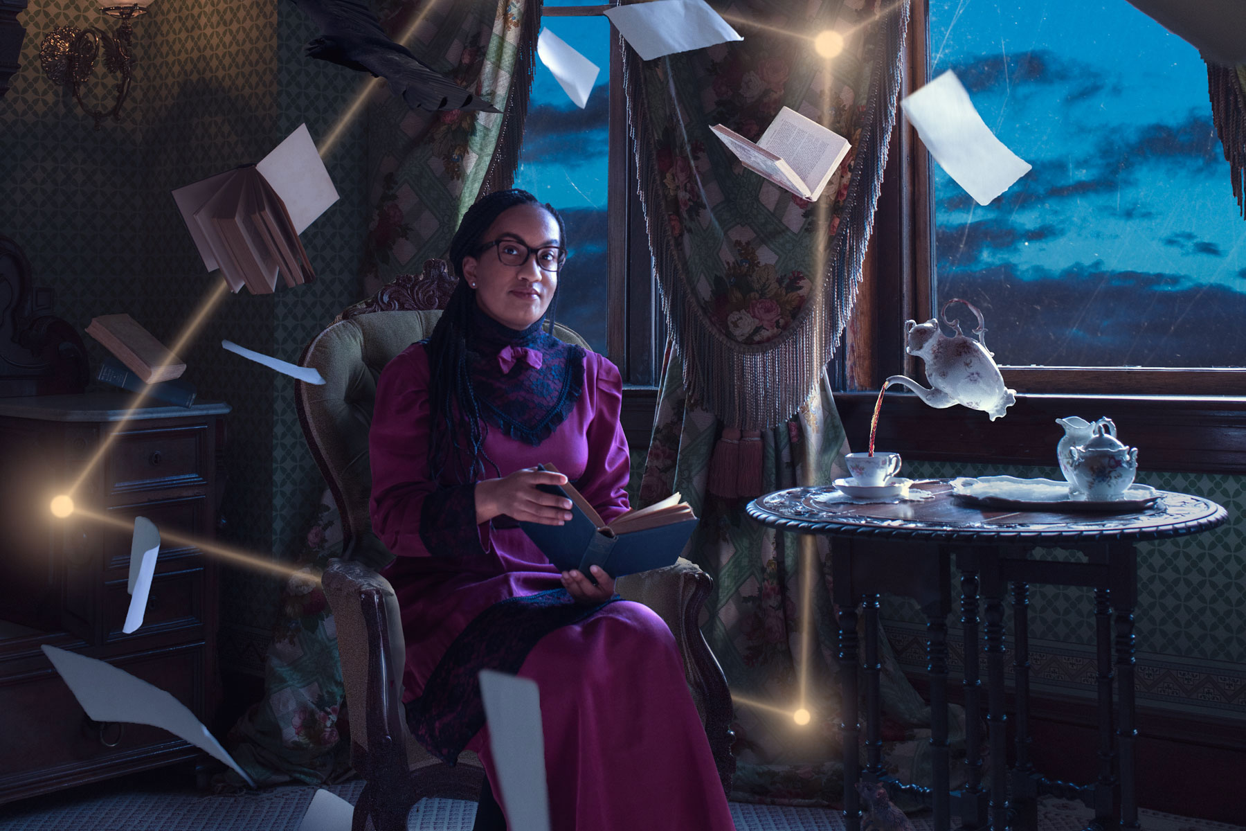
En Forme magazine commissioned me to capture a portrait of Nicole Glover, a Norfolk-based author. En Forme was hoping I could create something beyond a typical portrait. They wanted me to make something magical that incorporated elements from Nicole’s writing.
Creative direction + room for expression = perfection. Let’s rock.
Nicole’s writing is a mashup of historical African American fantasy fiction. I thought a levitation image (magic) in a period-appropriate setting (history) would be visually captivating and pay homage to Nicole’s work.
I called Nicole to see if she would be interested in dressing up in late-1800s garb and to go on a photographic adventure with me. She was. I got giddy.
Step 2 – The Sketch
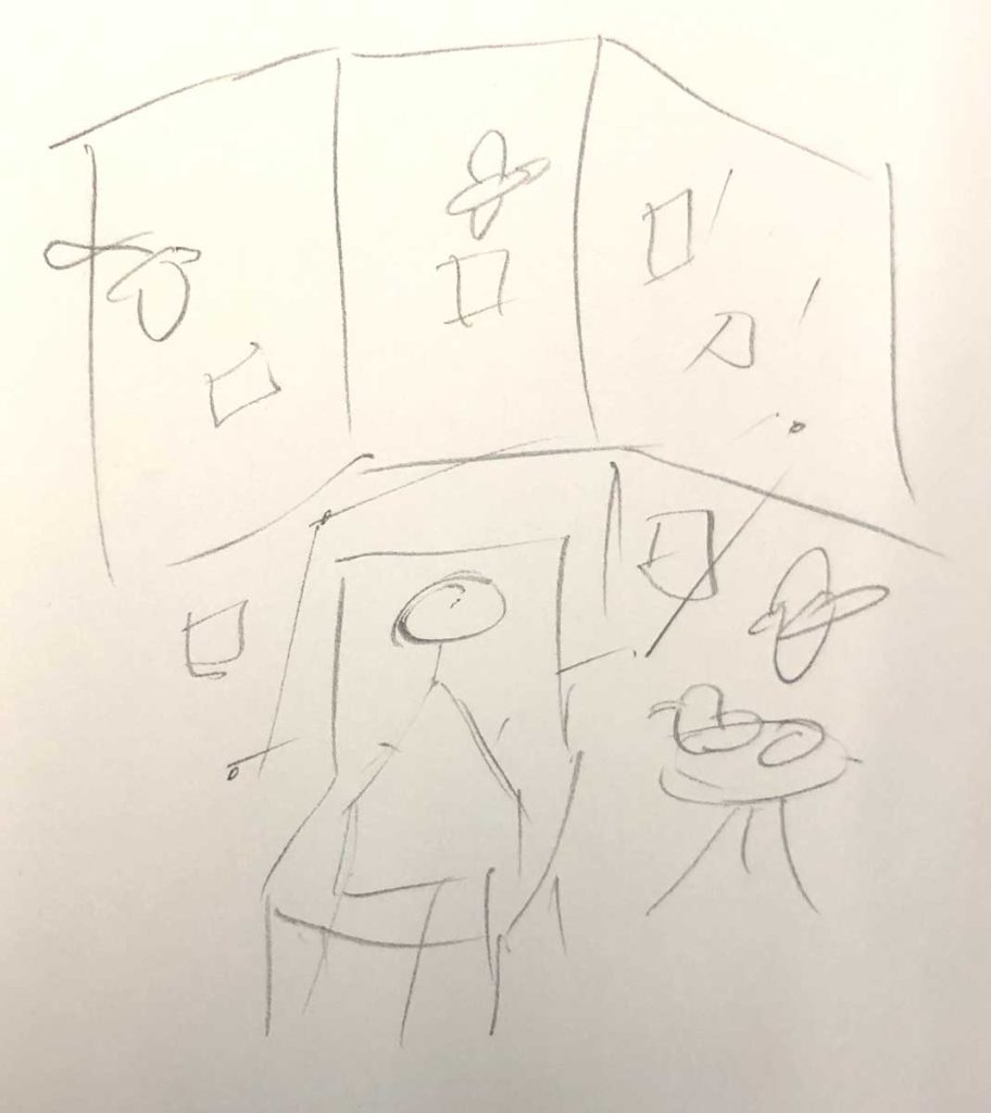
The elements I wanted to pull in from Nicole’s writing included birds, papers, a constellation and some other magical elements. I also wanted to leave plenty of room in the top for the magazine title and some darker room in the lower right for additional text.
Oh yeah, this is art. 😜
Step 3 – Secure the Location
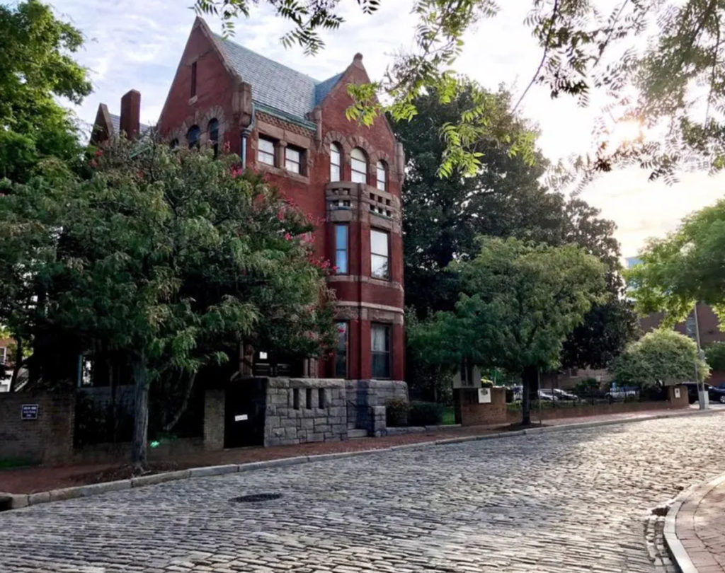
The first location that came to mind was the Hunter House Museum in the Freemason neighborhood of Norfolk. The Hunters chose to have their home live on as a museum of decorative arts and furnishings from the Victorian era. The interior look in one of the bedrooms was perfect and the two block walk from my studio was a bonus convenience.
The museum’s staff, Hanna and Renee, were very accommodating and even volunteered to assist during the shoot. Huzzah!
Step 4 – Get the Props
The Dress. I’ve really enjoyed working with the fine folks at Echoes of Time in the past for costumes. They came through again! They had the perfect dress and shoe combo for Nicole.
The Rest. The only other props I needed were pages from a book. Everything else was already at the Hunter House (tea set and antique books) or would be added in Photoshop (birds, stars, mouse). I just ripped blank pages from one of my Moleskin journals. I liked the size, color, and look of them.
Step 5 – Shoot the Shot
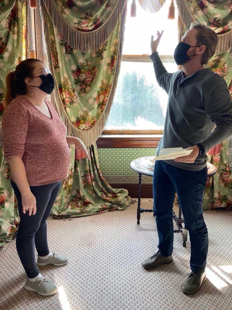
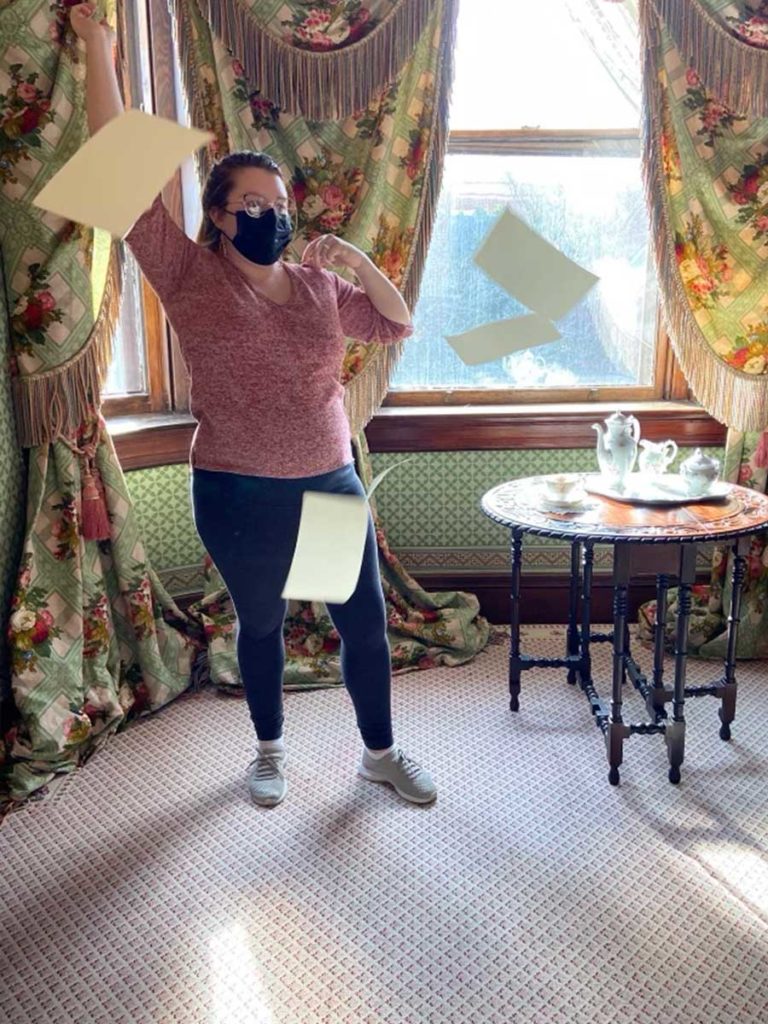
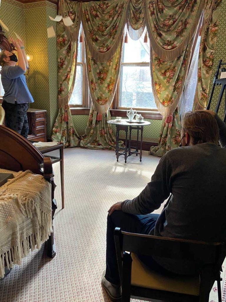
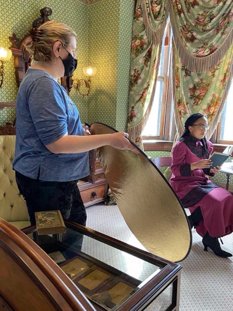
The big day came and the Hunter House crew was so helpful (see below).
There was one obstacle we had to overcome–Nicole wasn’t allowed to sit in the antique chair due to structural concerns of the chair. That meant additional blending work in Photoshop. So we shot an image of the empty chair and then images of Nicole in a different chair. You do what you gotta do, yo.
The final image was a composite of over 20 images and stock elements, including:
- Blank scene
- Nicole in chair
- Books individually
- Tea pot on table
- Tea pot floating
- Pages being tossed (lots of these)
- Birds
- Mouse
- Digitally created stars and light trails
- Textures
Step 6 – Edit
It took a while, ya’ll.
One of the biggest visual changes was converting the scene from day to night. We had limited access to the museum, so shooting at night was not an option. But the night time scene is more mysterious–it had to be done!
Many elements were added, including lots of shadowing/blending and subtleties like scratches on the window glass.
I recorded a timelapse of 80% of the edit. I forgot at the end to turn it back on after one of my breaks for a donut or something. Sorry about that. At any rate, here we go:
The Final
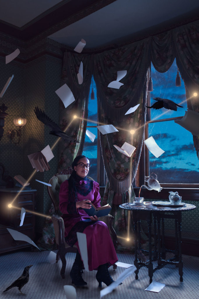
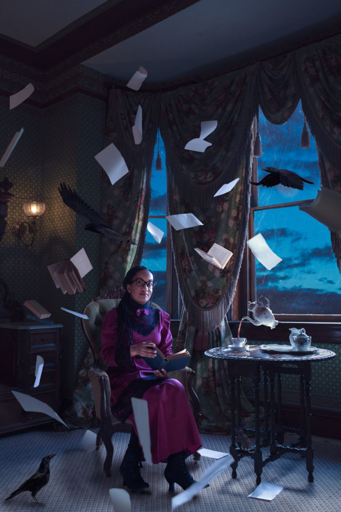
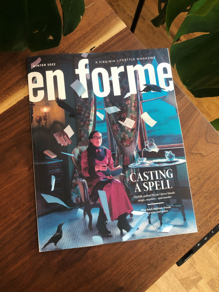
I delivered two different versions, one with the constellation and one without. En Forme opted for the constellation-free option for the cover and the full version for the article spread.
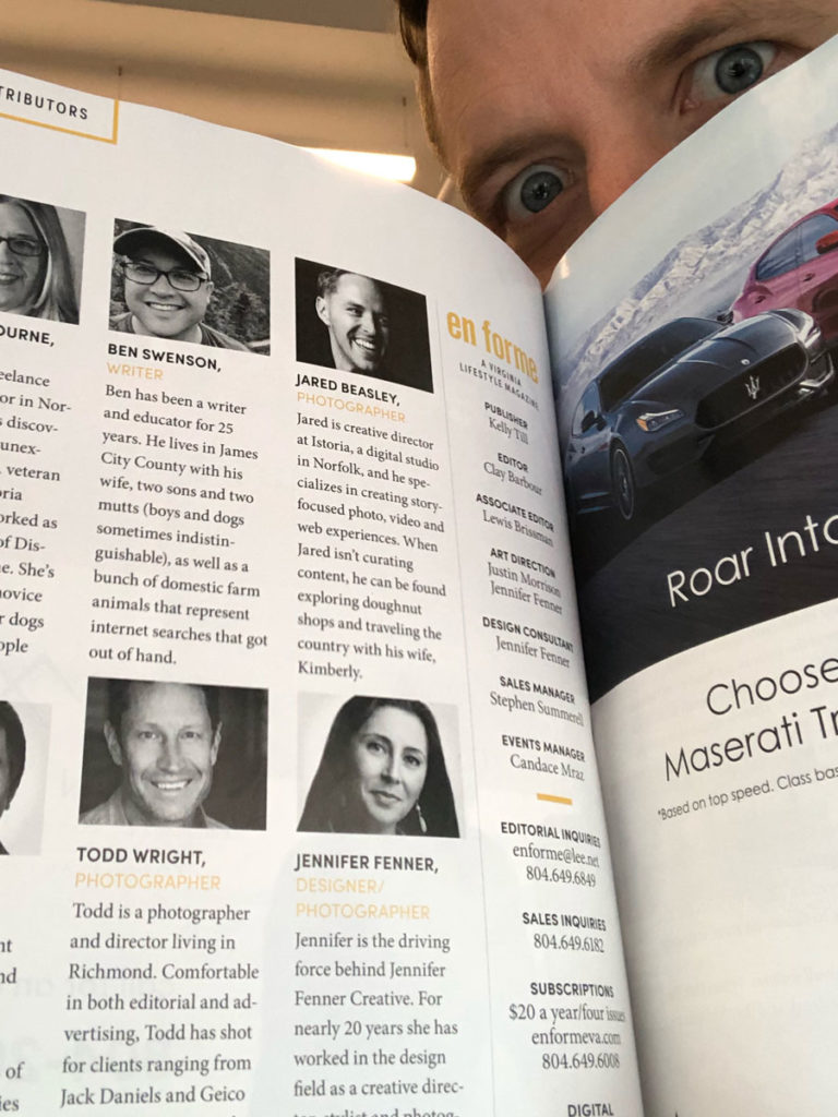
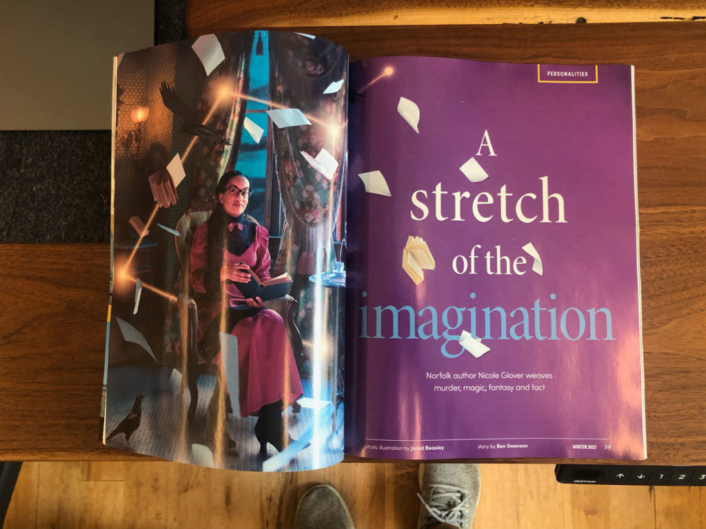
This was such an invigorating and rewarding project. I’m incredibly thankful. Shoutout to:
- Clay at En Forme. Thank you for trusting in me to create something cover-worthy and encouraging me along the way.
- Nicole Glover. Thank you for being willing to go on this photo adventure with me and trusting me to celebrate the literary worlds you create in photo form.
- Hunter House Museum. Ya’ll were so fun to work with and made this thing a reality.
There’s much to be said about Nicole’s work, and Ben Swenson did an excellent job articulating it in En Forme. Give his article a read.
Finally, support great work by a local author and check out Nicole’s work.
More Entries
About Jared
Jared Beasley is the founder of Istoria, a visual agency that creates story-focused experiences for brands that make the world a better place. Read more.
From the Gram
How I Created A Magical Image for En Forme Magazine’s Cover

Step 1 – The Idea
En Forme magazine commissioned me to capture a portrait of Nicole Glover, a Norfolk-based author. En Forme was hoping I could create something beyond a typical portrait. They wanted me to make something magical that incorporated elements from Nicole’s writing.
Creative direction + room for expression = perfection. Let’s rock.
Nicole’s writing is a mashup of historical African American fantasy fiction. I thought a levitation image (magic) in a period-appropriate setting (history) would be visually captivating and pay homage to Nicole’s work.
I called Nicole to see if she would be interested in dressing up in late-1800s garb and to go on a photographic adventure with me. She was. I got giddy.
Step 2 – The Sketch
The elements I wanted to pull in from Nicole’s writing included birds, papers, a constellation and some other magical elements. I also wanted to leave plenty of room in the top for the magazine title and some darker room in the lower right for additional text.
Oh yeah, this is art. 😜
Step 3 – Secure the Location
The first location that came to mind was the Hunter House Museum in the Freemason neighborhood of Norfolk. The Hunters chose to have their home live on as a museum of decorative arts and furnishings from the Victorian era. The interior look in one of the bedrooms was perfect and the two block walk from my studio was a bonus convenience.
The museum’s staff, Hanna and Renee, were very accommodating and even volunteered to assist during the shoot. Huzzah!

Step 4 – Get the Props
The Dress. I’ve really enjoyed working with the fine folks at Echoes of Time in the past for costumes. They came through again! They had the perfect dress and shoe combo for Nicole.
The Rest. The only other props I needed were pages from a book. Everything else was already at the Hunter House (tea set and antique books) or would be added in Photoshop (birds, stars, mouse). I just ripped blank pages from one of my Moleskin journals. I liked the size, color, and look of them.
Step 5 – Shoot the Shot
The big day came and the Hunter House crew was so helpful (see below).
There was one obstacle we had to overcome–Nicole wasn’t allowed to sit in the antique chair due to structural concerns of the chair. That meant additional blending work in Photoshop. So we shot an image of the empty chair and then images of Nicole in a different chair. You do what you gotta do, yo.
The final image was a composite of over 20 images and stock elements, including:
- Blank scene
- Nicole in chair
- Books individually
- Tea pot on table
- Tea pot floating
- Pages being tossed (lots of these)
- Birds
- Mouse
- Digitally created stars and light trails
- Textures


Step 6 – Edit
It took a while, ya’ll.
One of the biggest visual changes was converting the scene from day to night. We had limited access to the museum, so shooting at night was not an option. But the night time scene is more mysterious–it had to be done!
Many elements were added, including lots of shadowing/blending and subtleties like scratches on the window glass.
I recorded a timelapse of 80% of the edit. I forgot at the end to turn it back on after one of my breaks for a donut or something. Sorry about that. At any rate, here we go:
The Final
I delivered two different versions, one with the constellation and one without. En Forme opted for the constellation-free option for the cover and the full version for the article spread.


This was such an invigorating and rewarding project. I’m incredibly thankful. Shoutout to:
- Clay at En Forme. Thank you for trusting in me to create something cover-worthy and encouraging me along the way.
- Nicole Glover. Thank you for being willing to go on this photo adventure with me and trusting me to celebrate the literary worlds you create in photo form.
- Hunter House Museum. Ya’ll were so fun to work with and made this thing a reality.
There’s much to be said about Nicole’s work, and Ben Swenson did an excellent job articulating it in En Forme. Give his article a read.
Finally, support great work by a local author and check out Nicole’s work.
